Saturday, July 13, 2019

Portland Zine Symposium 2019

Hello Poor, lonely, loyal blog,

I am addressing the blog and not readers because I pretty much don't expect any readers considering I haven't posted in 3 years.

Time is shorter. Instagram is easier. Zines are not being made as often as they were (by me) and when they are they are made in smaller quantities.

However, the Portland Zine Symposium is next weekend and I continue to table every year. Next year will be the 20th. I may choose to stop my streak at 20. I have been to every one.

There will be lots of great zine makers and comic artists at the Zine Symposium next weekend. I will be there on Sunday. I don't have a new zine, but I have copies of the I Love Lucy zine, the Postcard Zine, and others.

I am also working on some zine related crafts ( but currently having some hiccups, so fingers crossed) and I will be back with some vintage mail related goodness).

I hope to see you there on Sunday. But, go both days, if you can. There will find new vendors each day.


Thanks for listening, dear blog.

Forever your old chum,
Krissy

Sunday, August 14, 2016

Vintage Color Palette - Wisconsin Dells

Vintage Color Palettes - Wisconsin Dells - find hex codes on the blog
  
The Vintage Color Palette today comes from a postcard from the 1930's or earlier. This big letter postcard from the Wisconsin Dells has a really inspiring color palette. I love the rosey-coral with the acid yellow and the mellow blue. And I always love a good vintage olive color. A great combination that would look awesome on pottery, packaging or in vintage home decor.

The hex color codes are from left to right: ee5b65, dccd4a, 7faecf, 92944d

Just for fun,I found a site where you can match interior paint colors to the hex color code numbers. I randomly chose the Benjamin Moore Color Collection. What the site will do is give you the closest four matches and it shows you the RGB breakdown so you can see easily how they differ. 

Here are the Benjamin Moore paint colors to match this palette. Pretty great matches. Now you can find your favorite Vintage Color Palette (browse quickly on Pinterest) and start painting your walls.

benjamin moore paints to match vintage color palette colors - ponyboypress blog

Thursday, July 7, 2016

Portland Zine Symposium this Weekend! 3 New Zines!


The Portland Zine Symposium is this weekend and I will be there at the Ambridge Event Center on Saturday. This year the Sunday event will be only workshops and will take place at the IPRC.  So, if you want to buy zines you have to go on Saturday. Doors open at 11 a.m. and it's free.

I have three small zines that are new and have some more copies of last years I Love Lucy fanzine that I sold out of last year. I will also have a small collection of vintage postcards with vintage stamps you can use to mail them.  Hope to see you there!

Ponyboy Press zines will be at the Portland Zine Sympoisum 2016


Wednesday, June 22, 2016

Vintage Color Palette - Gems U.S.Postage 1974

Vintage Color Palette - Gems U.S. Postage 1974 - see blog for hex codes - ponyboypress.com

I really don't need more things to collect. Believe me. However, I have recently gotten into stamps much more than I have been. Last weekend I went to a vintage paper show and mostly brought home a lot of vintage postage. I absolutely fell in love with these unique gem postage stamps from 1974. I adore the color choices they made and that they are designed to be used on the point like shown below:


Dreamy, right? So, back to the colors. Such a great choice here. The purpley grey, the seafoam blue/green and the unique pink and purple used all create a really interesting palette. If you like the combo, too, here are the hex color codes so you can use them in a project. Hex color codes are from left to right: a09294, bfe1db, f36a78, a16fad


Friday, June 3, 2016

Vintage Color Palette - 50 Jahre Postauto in Österreich


This pretty vintage color palette comes from a 1957 postcard celebrating 50 years of the automobile in Austria. I love this illustration and the choice of colors used. I did some research and found other postcards and stamps commemorating the same thing. These illustrations are so great.  See below for images I found on the internet. I believe that artist for the postcards is Atelier Harnisch.

The hex color codes for this VCP are from left to right: 9bd6d7, e47ec3, 678a9f, 89873f. Not sure what you can do with these? Use your VCP of choice to design web colors, logos, patterns, room colors, any design or color work. Want to get more ideas. See this post on Using Vintage Color Palettes.  Find more by clicking on the tag or on see our Vintage Color Palettes on Pinterest.


Found here
Found here

Found here

Found here

Sunday, March 20, 2016

Vintage Color Palette - Pride of Madeira

Vintage Color Palette - Pride of Madeira - read more and see hex codes on the blog ponyboypress.com

It's the first day of spring today and it's pretty grey and rainy here in Portland. This Vintage Color Palette, however, is spring-like enough for me. I love the muted pastel colors.  The title of this postcard is Pride of Madeira and Peach Blossom. It was printed in London and it's over 100 years old.

Madeira is a town in Portugal and the periwinkle-colored flowers on the cliffside here are called Pride of Madeira. What a lovely scene. I'd love to be there,

The hex color codes for these colors are from top to bottom: d85a77, f5b6bb, 7d9abd, adab8a

You can use these vintage color palettes to help design rooms, fabric, patterns, websites, backgrounds...all kinds of things. Follow us on Pinterest or Facebook to see all new Palettes posted.

Friday, March 11, 2016

Vintage Color Palette - Il Tinello Ristorante

Vintage Color Palette- Il Tinello - See color hex codes and more info on the blog. ponyboypress.com
Here is a springtime Vintage Color Palette inspired from a postcard for a restaurant in Rome, Italy. This postcard looks to be from around the late 1950's. It looks like a lovely place. I'll take a Sgroppino.

The hex color codes are from left to right: fa4994, 1aa7d9, fffcb9, fca794.

Not sure what to do with Vintage Color Palettes? You can use them to design the colors for your website, your living room or your next project. You can also use them to color patterns for online website design. Read more on this post about using Vintage Color Palettes from Ponyboy Press.

See all Vintage Color Palettes here or follow Vintage Color Palettes on Pinterest.

Monday, February 29, 2016

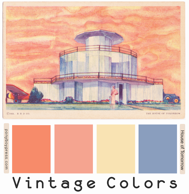
Vintage Color Palette - House of Tomorrow

Vintage Color Palette - House of Tomorrow - read more and see hex codes on the blog ponyboypress.com

This vintage color palette is super interesting. The postcard was made for the Century of Progress Expo which was held at the 1933 Worlds Fair in Chicago. This was The House of Tomorrow.

This house was what they envisioned for the future. The inside looks pretty mid-century and not that surprising from what I saw online. The garage has a pace for a small airplane.

The color palette must have been what they also envisioned for the future. It evokes luxury, ease and modern technology. I really like this combo. I think it would be great in a wallpaper pattern.

The hex color codes are left to right: f78b6a, f5a490, f9e3b3, 8a9ebe

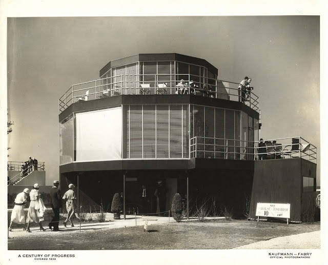
Here is an photo of the house from The Worlds Fair.

The House of Tomorrow - 1933 Worlds Fair - ponyboypress.com


Built for Chicago’s 1933-34 Century of Progress International Exposition, the House of Tomorrow showcased modern home convenience and creative practical new building materials and techniques to nearly 50 million visitors. 

This three-story, 12-sided house of the future held was made of steel and walls of glass with modern technologies like air-conditioning, a dishwasher, electric “eyes” to open the kitchen and garage doors and a built-in airplane hangar.

Friday, February 12, 2016

Vintage Color Palette - La Cascade du Chateau

La Cascade Vintage Color Palette - ponyboy press blog, see blog for hex codes

I love how the color choices of this postcard from the early 1900's make this waterfall at the castle look like it's on another world. Such an interesting combination of colors that you wouldn't think go together, but they work so well to convey the magical feeling a person must experience there.

The hex color codes are from left to right: 4281c5, fdb6d6, b05741, d0a7ac

Not sure what to do with Vintage Color Palettes? You can use them to design the colors for your website, your living room or your next project. You can also use them to color patterns for online website design. Read more on this post about using Vintage Color Palettes from Ponyboy Press.

See all Vintage Color Palettes here or follow Vintage Color Palettes on Pinterest.

Sunday, January 31, 2016

Vintage Color Palette - The Scaup Duck

The Scaup Ducks pastel; color palette from vintage postcard - ponyboypress.com. Hex codes on the blog.


Here is a lovely pastel Vintage Color Palette from a Wildlife Series vintage postcard from 1939. I love these muted and unique versions of these colors. The hex color numbers from left to right are:  f7f0ad, 9dd1c6, d9e4b6, d2b59d

Not sure what to do with Vintage Color Palettes? You can use them to design the colors for your website, your living room or your next project. You can also use them to color patterns for online website design. Read more on this post about using Vintage Color Palettes from Ponyboy Press.

See all Vintage Color Palettes here or follow Vintage Color Palettes on Pinterest.

Sharing is Caring